 |
||||||||||||||
| INVESTING IN ART | ||||||||||||||
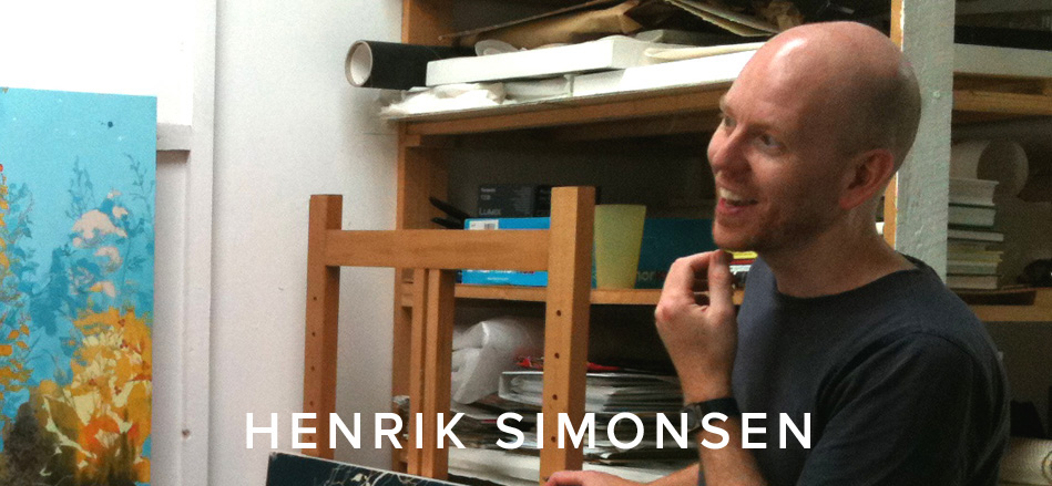
| When we first started showing Danish artist Henrik Simonsen's work at Eyestorm over seven years go, we were unaware of how successful and collectable his work would become. One of our most popular artists, Simonsen has wowed us with his supremely balanced, exquisite representations of nature, expertly setting off a rich colour palette against deft brushwork to create deeply alluring exercises in beauty and organic form. |
A consistent Eyestorm favourite with collectors, you only have to glance at his artist page to see his work doesn't hang around for long. Having primarily focused on screenprint editions with Eyestorm over recent years, his oil paintings are equally captivating to new audiences. | |||||||||||||
As his début solo in New York in 2012 revealed, two years of painting long hours every day and 20 canvases later after he began to prepare for it, Simonsen found himself back in an empty studio to start work again after tremendous success across the pond. With another solo show having just opened this month in Palm Beach, USA, international demand for Simonsen works shows no signs of slowing down. The element to Simonsen's work which seems to instantly hypnotise, is his pioneering relationship with colour. First and foremost, Simonsen is a shrewd colourist who understands palette as well as he does line. The many layers of colour applied in the creation of his screen prints are unsurpassed by other artists and in his words, 'build up a history of the work' as they are applied (his screenprints tend to have between 15 and 21 different layers of colour). The lineage of Simonsen's work is therefore expressed during the creation process; through the passing of time as each individual layer of intricately laced foliage comes into contact with colour. The repeated layers of hand-drawn lines with pigment are laboriously placed one on top of the other, gaining him a reputation in the industry as being a trailblazer for true commitment to contrast and specialist skill. In the case of 2011's now sold-out Eyestorm edition Blue and Orange , complimentary colours were created in an almost abstract myriad of different tones to result in a blueprint of success for proceeding editions. |
|
|||||||||||||
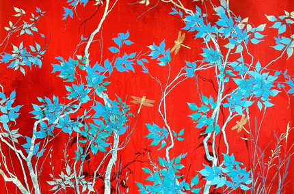
Similar contrasting and complimentary tones were picked out in Fragile (2012) and this highly representational work of a rooted tree with butterflies as leaves, was gone in a record six months following publication; a huge feat for an edition of 75. In quick succession, Red with Dragonflies soon sold out after appearing on the back cover of Soho House's House magazine - which was distributed to all members and in House clubs all over the world - and being specially selected for AAF NYC's marketing campaign in April 2012. The print's daring combination of strong colours with subliminal detail made it a show-stopping piece that commanded attention. The fair director, who purchased the piece for her own collection, remarked that its union of startling turquoise and rich red set off by the ornate delicacy of the golden dragonflies would make it the star of the show; and that it was, with 17 selling from the edition of 60 in just four days it was on display. |
||||||||||||||
As seen in Red with Dragonflies, the juxtaposition of the heavy build up of intense colour alongside delicate line, seems to have been the benchmark of Simonsen's success. But it is this 'line' which is the fundamental testament as the artist's has exemplary draftsmanship skills. The process of mark-making onto paper is for Simonsen the most direct way to portray the natural forms that feature and he never works from stencils or projectors but favours the direct approach of unimpeded pencil and brush to paper. He also hardly erases the marks that he makes, each one suggesting the next to encourage the forms to grow organically as he moves his way across the work. This way of working is immediately evident when studying the surface of his prints. In Simonsen's most recent pair of Eyestorm editions, Amber Dusk and Gold Dusk, the powdery softness of the flowers give way to an intense navy sky and are some of the most detailed studies of individual floral forms that he's ever offered. The larger edition of the two, Amber Dusk (October, 2013), has thus already sold almost half it's edition of 70, showing it could be another 6-month sellout by the time the spring art fair season is over. As Simonsen's work appears to be evolving as more and more representational whilst retaining its technical qualities of detail and finesse, his oeuvre's overall association with the decorative arts becomes increasingly palpable. Inspired by 18th and 19th century Rococo and William Morris- style designs, Japanese and Chinese screen painting and fabrics, the credentials of Simonsen's work could run the risk of being considered as having reached a highly-ornate ceiling. And yet as we have learned, this is an artist who is taking off in America, now, and for the first time in his 18 year career. Appreciation has been earned for his contemporary take on nature coupled with minutely observed studies of flora and fauna, executed in a meticulously controlled hand. Two punchy prints punctuated by pours and splatters shows his work can be liberated and less scrupulously devised. Tangled and Yellow and Blue are such works which explored rough-textured brush strokes and the liquid reality of paint. They're playful in colour and composition and with one framed print of Tangled left available, another example of Simonsen's staunch artistic development will soon be seen again only on the secondary market. |
|
|||||||||||||
With Simonsen's work fast selling out, Eyestorm took stock last October and worked alongside the artist to produce a screen print edition which is entirely novel and a new venture for the artist. The inexhaustible richness and diversity of nature, the artist's greatest inspiration, is celebrated in Gold Dusk. The stunning 19 -colour screenprints are each uniquely hand-finished by Simonsen with a paintbrush, causing this piece to bridge the gap between painting and screenprinting. Offering yet more nuances of light and shade with the incorporation of both copper and gold leafing, when this piece is boldly displayed alongside its sister print Amber Dusk (as at two international art fairs last year following it's release) you can truly appreciate the depth of colour, thought and sophistication of craftsmanship that this artist can achieve in one work. The piece is a labour of love and refinement and just rightly, it is the collector's item in a rare edition of just 15; whereas previous editions to date by the artist have been in quantities of up to 75. |
|
|||||||||||||
In future weeks we will be presenting the artist's newest screenprint, Hemlock Blue, and another exclusive publication is planned for later this year, which we hope to launch at Multiplied Art Fair at Christie's and after that at art fairs internationally. Having represented his work all over the world last year, Simonsen has become a leading artist for Eyestorm with strong sales as across the board, in every country we've visited. He is one of Eyestorm's most well-received artists when his work is viewed in person and where the technical skill and craftsmanship which is present in each and every single one of his prints, cannot be denied. The art fair setting is also the chance for the new buyer or established collector to compare work to those of others in an equal environment. Gold Dusk, Amber Dusk and new print Hemlock Blue will be on show in London twice in 2014 as well as in Hong Kong, New York and Singapore, so do watch out for tickets as these works have to be seen in person to be truly believed. Simonsen’s work is accomplished as both contemporary and traditional art, in colour as well as line and in sensitivity to the balancing of all these varying elements. The sumptuous and complex forms that make up nature and the mystery of it which he revels in, are universally endearing and so continue to support the immense popularity of his work. Simonsen has exhibited in group shows with modern masters Bridget Riley, Victor Pasmore, Stephen Conroy and Frank Auerbach. His solo shows have gleaned worldwide acclaim, including a successful solo exhibition at the Royal Opera House. His work has also been selected and specially commissioned for public museum collections, including for a Belgian art museum where his work features alongside that of artists: Carl Andre, George Baselitz, Derek Boshier, Anthony Gormely, Clas Oldenburg and Gerard Richter. |
|
|||||||||||||